
Implementing Variable Fonts
Learn by doing
The best way to understand variable fonts is to jump in and start playing with them. There’s no need to wait—browser support is very high and there are a couple of different ways you can put variable fonts to work in your projects today:
- Use the Google Fonts API (as of v2)
- Host them yourself with @font-face (if you have the font files—and license, if required)
- Via the new Google Fonts UI
On this page, you’ll find details about:
Looking for more info on how variable fonts work and how to design with them? Start with Designing with variable fonts.
Variable fonts are well supported and ready to use in production

Google Fonts API
The new API for requesting fonts lets you select any of a growing number of variable fonts in the Google Fonts catalog. The syntax is pretty flexible, and allows you to call for a specific combination of axes, static values, and ranges. Because the Google Fonts developer documentation site is so comprehensive, here the focus will specifically be on working with variable font axis and range combinations so you have the greatest flexibility available when designing your project.
Making the request
After selecting a variable font to use via the API, pay special attention to the changes in syntax from v1 to v2. Requesting Yanone Kaffeesatz as a variable font with a weight axis range of 200–700 looks like this:
https://fonts.googleapis.com/css2?family=Yanone+Kaffeesatz:wght@200..700
Let’s break down the parts of the request:
css2?family=[font name]:[axis keyword]@[range (low)]..[range (high)]
First, note that while the address endpoint is css2, specifying the font name is relatively unchanged from the previous version of the API. It’s after the colon that things change more dramatically. This is where the axis or axes are listed, followed by an @ symbol, followed by values indicating the ranges requested. The API allows for individual values to be specified, but here the request uses the “[range (low)]..[range (high)]” syntax to request the full weight range of 200 to 700. If you only require the weight to cover part of the available range, you can adjust the values accordingly and end up with a slightly smaller download.
Once requested, you can specify any value within that range in your CSS. In the case of the weight axis, that corresponds to the standard font-weight attribute.
Italics can be requested separately with the corresponding weight axis range, or as a combination (if available) of both upright and italic in the full requested range.
Just italics with a weight range of 200-900:
https://fonts.googleapis.com/css2?family=Crimson+Pro:ital,wght@1,200..900
Or both upright and italics in the same range:
https://fonts.googleapis.com/css2?family=Crimson+Pro:ital,wght@0,200..900;1,200..900
There are detailed notes on the syntax in the documentation, but here are a couple of points to remember:
- Keep the axes listed in alphabetical order
- Keep corresponding value sets in numerical order
  p {
    font-weight: 350;
  }
  strong {
    font-weight: 575;
  }
Range versus static point
This version of the API can serve both static and variable fonts—and indeed static instances of variable fonts. In other words, the same URL structure can retrieve the static fonts, a variable font range, or a variable font instance at a single specific value. Although in some cases it may be useful to request, say, only the 575 weight of a given typeface, the real benefits of using variable fonts often lie in using more of the available range, which is why that’s the focus of most of the demos on this site.
Crimson Pro, static, normal weight:
https://fonts.googleapis.com/css2?family=Crimson+Pro:400
Crimson Pro, variable, specific weight:
https://fonts.googleapis.com/css2?family=Crimson+Pro:wght@450
Crimson Pro, variable, full weight range:
https://fonts.googleapis.com/css2?family=Crimson+Pro:wght@200..900
The first example above is closest to the syntax previously supported in the API. The second example includes the wght keyword with a specific weight listed after the @ sign, indicating a static instance from the variable font. The third example is a request for the full weight range of the variable font.
Self-hosting variable fonts
Hosting variable fonts on your site is not much different than hosting standard ones, but there are a few key parts that must be included in order for them to work best. While there have been several iterations of the specification, these examples will show the most current and complete implementation to ensure the broadest compatibility.
The code example shows how the @font-face rules would look in your CSS.
So the first part you’ll notice is the source. Because the CSS specification is evolving, including both format hints guarantees it will work now and in the future, once the full specification is supported in browsers. The first syntax (woff2 supports variations) is the more modern of the two, since there will also be color fonts, so there needs to be a way to indicate combinations of features. The second (woff2-variations) is the currently supported syntax in all supporting browsers. As support evolves, the newer syntax will take over without compromising support for older browsers.
Next, you’ll notice lines that show ranges for font-stretch, font-style, and font-weight. These help inform the browser as to how the font should behave and provide some indication about what CSS values are valid for that font.
  @font-face {
    font-family: Roboto Extremo;
    src:
      url('..path/to/fonts/roboto_extremo.woff2')
      format(‘woff2 supports variations’),
      url('..path/to/fonts/roboto_extremo.woff2')
      format('woff2-variations');
    font-stretch: 25% 150%;
    font-style: oblique 0deg 10deg;
    font-weight: 100 900;
    font-display: swap;
  }
Font-stretch
This is supplied as two percentage values: first low, then high. There will be some fonts that have ranges that don’t conform to the specification (which calls for 100% to be the “normal” width), but even if the range is 3-5 or 60-220, they still have to be expressed as percentages here.
font-stretch: [low]% [high]%;
Font-style
Currently, font-style should only be specified for variable fonts in two scenarios: if you are loading a font file that only contains italics (such as when loading upright and italic font files and grouping them with the same family name), or if your variable font contains a slant axis but no italic one.
If you are loading an italic-only font file:
font-style: italic;
If you’re loading a font file with a slant axis, you have to specify the low and high degree values:
font-style: oblique 0deg 10deg;
Note: Due to some inconsistencies with how browsers handle variable font files that contain both italic and upright variants (and also files that contain both italic and slant axes), in these scenarios it’s best to omit the font-style line completely.
Font-weight
This is also supplied as low and high values:
font-weight: 100 1000;
Font-display
While font-display is not required, it is good practice to include it to get content on screen as fast as possible.
Why this matters
It’s important to supply these values so the browser can make more intelligent decisions about how to render the font when the CSS values fall outside the range or are omitted entirely. If the low-end value for font-weight is 300 but the CSS calls for font-weight: 100, the browser will know to clamp to the lowest valid number (in this case 300), avoiding a synthesized result.
Once you have the @font-face rules declared, you can go about specifying the font-family and attributes just as you would if using the API or any other method of loading the fonts.
Variable fonts in the Google Fonts UI
Finding variable fonts
You can now find variable fonts right in the Google Fonts interface itself. A checkbox in the search interface lets you “show only variable fonts” in the results. Ticking that box is the quickest way to browse what’s available to customize.
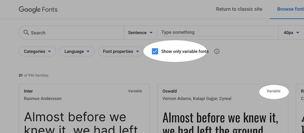
When you select one of the families with the “Variable” label in the top right corner, you’ll find the variable version at the bottom of the styles list.
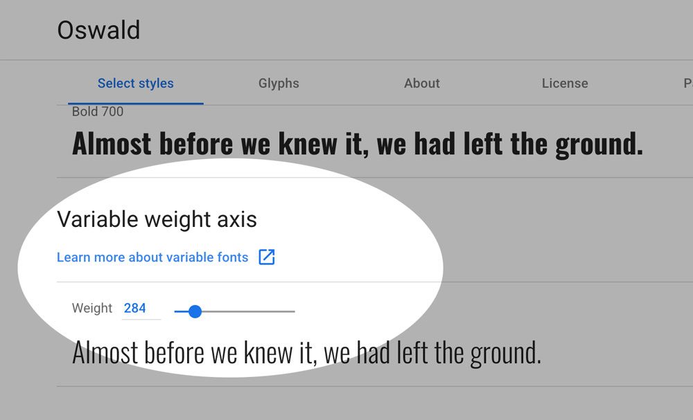
Individual Styles
To create a custom style, just move the slider to the desired value (shown above) and follow the same steps as with any other font.
This process gives you an embed code for a single instance (a font-weight of 284, for example)—or multiple static instances if you select more than one. Enabling the whole range requires only a small change to the code.
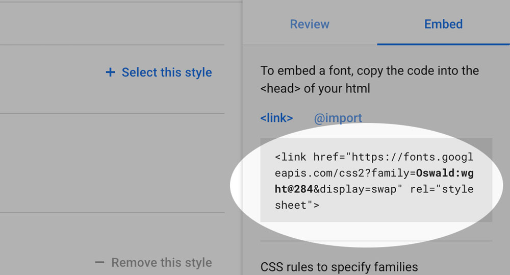
The embed code for Oswald with a static weight would look like this:
<link href="https://fonts.googleapis.com/css2?family=Oswald:wght@284&display=swap" rel="stylesheet">
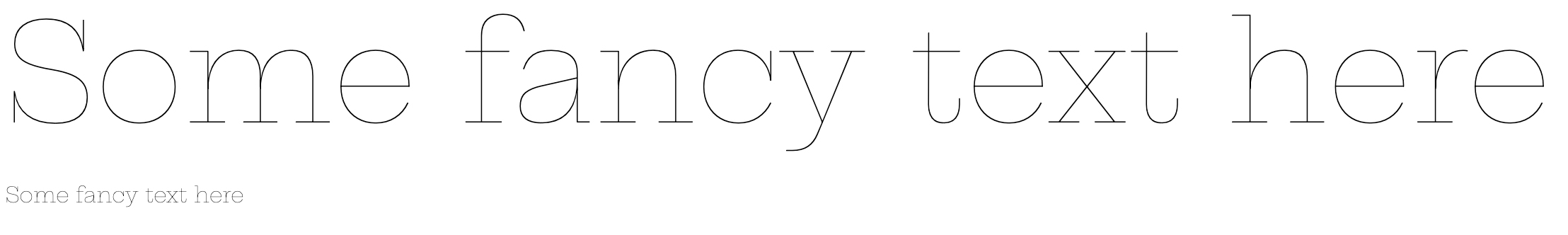
Some families have a range of weights that go beyond the traditional range of 9 separate fonts from 100 to 900. For example, here’s the minimum weight of Hepta Slab, a font-weight value of 1! This is new. As a designer, you’ll need to handle it with care, because while it looks fantastic at large sizes on high-DPI screens, it can become extremely faint or even disappear completely on low-resolution devices at smaller font sizes.
    <link href="https://fonts.googleapis.com/css2?family=Hepta+Slab:wght@1&display=swap" rel="stylesheet">
    <span style="font-family: 'Hepta Slab', serif; font-weight: 1">
Fluid Ranges of Styles
If you look at the variable style slider detail, you’ll see that you can move the slider to each end of the range to discover the minimum and maximum values of the family (in this case, 200 and 700). Replacing the single value “674” with the “..” range syntax for that family (“200..700”) gives you instant access to the entire range:
<link href="https://fonts.googleapis.com/css2?family=Oswald:wght@200..700&display=swap" rel="stylesheet">
Of course, not all designs will take advantage of the complete range of styles, but the real value of variable fonts is the ability to expand the range of your design while reducing the amount of font data transferred. In this case, you would get the entire range of 200-700 in weight for the equivalent of 2 or 3 individual styles—a single 25kb download!
Additional Axes
There are 3 key benefits to variable font technology: to compress, to express, and to finesse. They tend to be realized in that order.
The Google Fonts API has been delivering the compression benefit to end users for a few families (like Oswald and Comfortaa) since early 2019; if a page uses 2 or more styles, and a user has a browser that fully supports variable fonts, then a single variable font file URL is served for all of the weights, while continuing to serve several files for each style to older browsers.
This all happened totally behind the scenes, without any UI changes. Now that Google Fonts has a UI for picking custom weights, you can easily use exactly the weights you want, and as many as you want, while still reaping the compression benefits.
But there’s more to variable fonts than just compression. Other axes either offer more expressive options for display typography, or more ways to fine-tune text typography. These will first become available behind the scenes in the API, and will be described in the specimen pages’ “About this font” descriptions and the API docs. The information available on this site, along with the additional resources, give you entirely new possibilities to expand your design vocabulary.
When thinking about the finesse benefits, have a look at how this site was designed and developed as explained in the About this site section. This highlights some of the ways variable fonts can be used to improve accessibility and the reading experience for more users, in more contexts, on more devices. Each aspect may be small on its own, but taken together, all of these factors dramatically improve the experience as a whole.
Progressive enhancement and legacy browser support
To support the broadest set of browsers and devices, it’s important to set up your CSS with standard values first, and the variable styles within an @supports block. If you’re using the Google Fonts API, good news—the API is smart enough to supply the static font files if the browser doesn’t support variable ones, so all you have to do is manage the CSS side of the equation. If you’re hosting the fonts yourself, you just need to add a reference to the variable font family inside the @supports block.
Adding in the font-synthesis: none declaration prevents browsers like Safari or Firefox from artificially bolding or italicizing the font, which can lead to unexpected and less-than-ideal results.
  p {
    font-synthesis: none;
    font-weight: normal;
  }
  strong {
    font-synthesis: none;
    font-weight: bold;
  }
  @supports (font-variation-settings: normal) {
    p {
      font-weight: 350;
    }
    strong {
      font-weight: 575;
    }
  }
Performance
Whether hosting the fonts yourself or using the Google Fonts service, there are steps you can take to guarantee the best possible performance on your site. It helps to understand a bit about the loading and rendering process. The basic flow goes something like this:
- Browser requests a page
- Browser downloads HTML and linked CSS
- Browser parses HTML and CSS
- Browser initiates download of any linked CSS assets (like fonts)
- Browser now waits up to 3 seconds before starting to render the page while waiting for web fonts to download
- If the fonts arrive within 3 seconds, the page is rendered as it should be
- If the fonts have not fully loaded, the browser renders the page using fallback system fonts, rerendering the page once the web fonts arrive
Ideally, the fonts load quickly and the page is rendered correctly the first time—but often that’s not the case, which brings us to the next scenario. The phenomenon of text being rendered in the fallback fonts and then rerendering with the proper ones is known as a Flash of Unstyled Text (FOUT).
Given that the purpose of any site is generally to deliver content, FOUT should be preferred, and indeed hastened if possible. Introducing a delay of at least 3 seconds greatly increases the chances of users abandoning the process altogether and going elsewhere. The W3C actually introduced the ability to tell the browser how to behave in this scenario, and the Google Fonts service and API now support it too.
This comes in the form of an attribute called font-display. By providing a value of swap, we tell the browser to render the page right away with fallback fonts, and then redraw the page once the fonts have loaded. This is only part of the solution, though. The next step is to include a web font loader, which lets you style the fallback fonts during the loading process. This helps minimize any reflow of content once the browser rerenders the page after the web fonts finish loading. It requires some JavaScript, but it’s a really worthwhile enhancement of the user experience.
The first part of this solution is easy: simply append &display=swap to the API request. One of the requests above for Crimson Pro would then look like this:
https://fonts.googleapis.com/css2?family=Crimson+Pro:wght@200..900&display=swap
You can learn more about what font-display does and what options it affords on the W3C specifications page and on the MDN Web Docs site.
To take your solution further, take a look at Bram Stein’s FontFaceObserver, or read more about font-loading performance in general in this post by Zach Leatherman.
Next steps
Looking for more info on how variable fonts work and how to design with them? Start with Designing with variable fonts. To learn even more, browse the resources section.